ChiliProject is not maintained anymore. Please be advised that there will be no more updates.
We do not recommend that you setup new ChiliProject instances and we urge all existing users to migrate their data to a maintained system, e.g. Redmine. We will provide a migration script later. In the meantime, you can use the instructions by Christian Daehn.
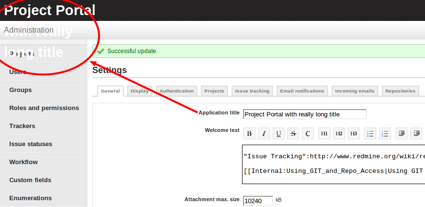
Layout issue when using really long Application Title (Bug #804)
Added by John Daily Jr at 2011-12-28 03:28 pm.
Updated at 2011-12-28 03:59 pm.
Description
The Application title wraps down below header.
Related issues
| duplicated by Bug #825: Top Title premature split ? | Duplicate | 2012-01-11 | ||
| duplicated by Bug #907: long title of the chiliproject's site | Duplicate | 2012-02-27 |
History
Updated by Holger Just at 2011-12-28 03:38 pm
A simple solution would be to not use such a long application title :)
However, I you really have to do that, what do you propose we solve this?
- We could shorten the title with ellipsis
- We could perform some layout magic.
The latter would probably be preferable. But we still would have to deal with line breaks in case of narrow browser windows. And I personally have no idea on how to solve this now. If you have a proposal for that, please provide it. Also note that the spot where the application title is now was originally thought of as a place for a graphic logo (which is not yet decided on so it's text for now)
Given that, I'd still prefer my first solution: "Don't use a long application title."
Updated by John Daily Jr at 2011-12-28 03:42 pm
:( Yea, maybe I got a little too excited, being my first bug report and all, I'm trying out some css changes.
Updated by John Daily Jr at 2011-12-28 03:45 pm
John Daily Jr wrote:
:( Yea, maybe I got a little too excited; being my first bug report and all. Increasing the #logo width to 600 seems to fix it.
Updated by John Daily Jr at 2011-12-28 03:46 pm
Increasing the #logo width to 600 seems to fix it.
Updated by Holger Just at 2011-12-28 03:54 pm
Yeah, but only if you have a rather wide browser window. If you narrow it down, the navigational toolbars on the right wrap around to the next line and break the layout again.
Given the min-width of 900px of the whole layout, the text couldn't be any much wider than the current 200px anyways because depending on the name of the logged in user and the translated language, space becomes really sparse. While you are free to define a higher min-width in your own theme, I'm hesitant to do that in the core because it would break compatibility with common tablets and smaller screens.
P.S. Welcome to ChiliProject and thanks for reporting your issues! This is always welcome.
Updated by John Daily Jr at 2011-12-28 03:59 pm
Thanks, That makes sense, I just created a new theme with the necessary changes and all is well. I'll close out the issue.
:)
- Status changed from Open to Closed