ChiliProject is not maintained anymore. Please be advised that there will be no more updates.
We do not recommend that you setup new ChiliProject instances and we urge all existing users to migrate their data to a maintained system, e.g. Redmine. We will provide a migration script later. In the meantime, you can use the instructions by Christian Daehn.
Add a summary to projects (Feature #176)
Added by Holger Just at 2011-02-11 02:15 pm.
Updated at 2011-03-13 10:16 am.
| Status: | Open | Start date: | 2011-02-11 |
|---|---|---|---|
| Priority: | Normal | Due date: | |
| Assignee: | % Done: | 0% |
|
| Category: | - | ||
| Target version: | - | ||
| Remote issue URL: | http://www.redmine.org/issues/6722 | Affected version: |
Description
There are two places where projects are displayed in mass: /projects and the project's admin. On both places, part of the description is displayed. This is suboptimal as the view gets really messy if you include some more verbose status information into the description (or even images like project logos).
Thus I propose adding a short summary to the project which is displayed in these locations. It would make the view much clearer and more usable because of better content.
Additionally, the vertical flow /projects view looks a bit weird today. This is caused by some sloppy CSS in the default theme. It could be fixed with some minor addition as "shoecased" in http://dev.holgerjust.de/projects.
Related issues
| related to Feature #678: Redesign 'view all projects' page | Open | 2011-11-03 |
History
Updated by Derek Montgomery at 2011-02-11 02:46 pm
Big +1 on this one, this has always bugged me deeply.
Updated by Stephan Eckardt at 2011-02-11 05:33 pm
I applyed an existing Redmine patch for this feature to ChiliProject and added tests for it.
Here is the feature branch:
https://github.com/finnlabs/chiliproject/tree/f/176-add_a_summary_to_projects
Pull request sent.
- Status changed from Open to Ready for review
Updated by Wieland Lindenthal at 2011-02-11 06:23 pm
Hi Holger,
I always disliked any description in the projects overview. One reason might be that in our installations we almost always have 30+ projects in that overview so that the list gets very long even without descriptions.
Further, I believe that users click on "Projects" when they search for a project that they are not member of. If they were member of that specific project, they would use the "Jump to project" select box. So I think that the projects view is mostly needed when the "Jump to project" select box does not contain the project that the user is searching for.
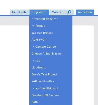
So if you ask me, I would kick out any description and even the whole projects page. I would change the link "Projects" in the top menu to something like a drop down list of all projects. Taskpoint has a nice implementation for that. See my screenshot:
Another idea could be to merge the projects list in the screenshot with the "Jump to project" select box. The projects of which the user is member go into a separated part on top of that list. This would mean that you could kick out the whole projects link in the top menu.
Wieland
- File projects_drop_down.png added
- Status changed from Ready for review to Open
Updated by Eric Davis at 2011-02-11 07:25 pm
Holger:
I'm not sure about having a second description. I understand the points about the auto-truncation but I don't want to require someone to duplicate content. It looks like Stephan's patch will auto-detect which one to use which might work. Might need to have some message that describes the difference between "description" and "summary".
Wieland:
I always disliked any description in the projects overview. One reason might be that in our installations we almost always have 30+ projects in that overview so that the list gets very long even without descriptions.
Further, I believe that users click on "Projects" when they search for a project that they are not member of. If they were member of that specific project, they would use the "Jump to project" select box. So I think that the projects view is mostly needed when the "Jump to project" select box does not contain the project that the user is searching for.
So if you ask me, I would kick out any description and even the whole projects page.
I disagree with removing the Project lists completely. It serves a useful purpose but has a very poor design. What I propose is that we:
- Remove the current Public Projects list (/projects)
- Modify the Admin Projects list to work for the Public Projects list (so /admin/projects and /projects are identical)
- Only show the action menus if the user has permission (Edit, Archive, Copy)
I think this has a bunch of benefits:
- We use a single common interface for projects
- Admins can administer projects in one click (Project menu) versus two (Admin > Projects)
- Users with permissions to add, edit, or copy projects can now use /projects directly.
- The admin menu already has a "Project search" built in so it will be easier to find a specific project than having to scroll the list.
All that said... I think having a short description in that list would be useful. Maybe the full description could be in a hover tooltip (like we use for Timelogs)
I would change the link "Projects" in the top menu to something like a drop down list of all projects. Taskpoint has a nice implementation for that.
That's from the Shane and Peter theme which Taskpoint has adapted. I like that menu because it's a plain HTML list so you can open multiple projects in new tabs (unlike the current Jump to Project). If you click the menu header (Project) it goes to /projects
Any other thoughts on:
- adding a summary field
- merging the public and admin project lists
- (pretty sure we already are going to use the Shane and Peter theme's menu)
Updated by Holger Just at 2011-02-22 07:39 pm
Eric Davis wrote:
I'm not sure about having a second description. I understand the points about the auto-truncation but I don't want to require someone to duplicate content. It looks like Stephan's patch will auto-detect which one to use which might work. Might need to have some message that describes the difference between "description" and "summary".
This is exactly my point. You can enter a summary, but you don't have to. But this could probably be explained with a short help text. Currently, you have to decide between two different things when writing your description:
- Having a full description which fully describes the project and possibly gives likes to resources, or
- having a short one-liner which looks good in the project overview but probably lacks information.
For me, the projects list serves the purpose of getting an overview of that projects are there and what they do. You should be able to browse the project list and be able quickly get purpose of the project. Once we can live with having more Javascript (and I'd loved to), we could even create some sort of quick-view effect where you could get more information about a project with a simple click. But in the end, this view is just for browsing stuff, which is esp. useful for new staff to lookk around.
This use case is fundamentally different from knowing my projects and just wanting to jump to them quickly. This is currently enabled with the select box on the upper right hand (or the javascript dropdown menu in the S&P theme). Some time ago, I proposed a patch to have all visible projects in that list (not just member projects), see #5556 on redmine.org. This patch could be extended so that member projects are displayed different from non-member projects. For large project lists it could even be convenient to let the user decide which projects should be in there...
- Remove the current Public Projects list (/projects)
- Modify the Admin Projects list to work for the Public Projects list (so /admin/projects and /projects are identical)
- Only show the action menus if the user has permission (Edit, Archive, Copy)
I strongly disagree that removing the /projects view or just replacing it with the admin view would be beneficial. The admin view and the /projects view server two completely different use-cases. The former is used to administer the projects, create, delete and archive them. Normally, you as admin know very well which project you are after here. The /projects view on the other hand is to browse through available projects. While you could add some of the functionality of the admin view here, I would see it as a common view to get an overview about available projects primarily and an admin GUI only secondarily (or not at all).
Yes, it has a bad CSS design currently. But I'd like to point to http://dev.holgerjust.de/projects again, where you can see that it's rather clean with very few adaptions.
Updated by Holger Just at 2011-02-22 07:41 pm
Oh, and I also disagree on JPL's decision on removing the description (or summary) from the admin view.
Updated by Eric Davis at 2011-02-22 11:53 pm
Holger Just wrote:
Once we can live with having more Javascript (and I'd loved to), we could even create some sort of quick-view effect where you could get more information about a project with a simple click.
We could use the CSS hack that done in the time entries for tooltips and not have to use Javascript at all. It uses a hidden div that appears when hovering over a parent element (not documented that well but I've used it in a few places).
I strongly disagree that removing the /projects view or just replacing it with the admin view would be beneficial. The admin view and the /projects view server two completely different use-cases. <snip>
I have a different opinion. Both of these pages list the projects in the system and should provide some information about each project. When I am browsing the projects there are a few actions I want to take:
- Open up a project to work on
- Edit a project's settings ("Manager" role)
- Archive an old project (Admin)
- Copy a project
- Search through the projects
To be frank about this: the current projects list is worthless especially if you put in any kind of HTML into them (which is why my projects are mostly blank https://projects.littlestreamsoftware.com/projects) and the project admin panel is awkward to use. Of the two, I think the admin panel is better because it has search and uses a similar design as the issues list.
Yes, it has a bad CSS design currently. But I'd like to point to http://dev.holgerjust.de/projects again, where you can see that it's rather clean with very few adaptions.
It is cleaner but it's still difficult to scan. With the freeform summary text and different sizes for the project name I feel like I'm forced to read the entire page to find something.
That said, I'm open to suggestions on a better UI for this. I think a table with an entire row for description (summary/short description) might look good too.
|---------------------------------------------|
| Project A            | Archive Copy Delete  |
|---------------------------------------------|
| We want to do blah blah blah in this project|
| in order to take advantage of XYZ           |
|---------------------------------------------|
Holger Just wrote:
Oh, and I also disagree on JPL's decision on removing the description (or summary) from the admin view.
I don't like it either but I understand the reason behind it.
Updated by Holger Just at 2011-03-02 06:07 pm
Eric Davis wrote:
To be frank about this: the current projects list is worthless especially if you put in any kind of HTML into them (which is why my projects are mostly blank https://projects.littlestreamsoftware.com/projects) and the project admin panel is awkward to use.
That's exactly the point of the patch. You can put extensive markup into the project description, but use a summary for the project overview pages.
Of the two, I think the admin panel is better because it has search and uses a similar design as the issues list.
The project lists are strongly hierarchical data. A table layout is not suitable for this kind of data. It might be hacked into submission, but that' not what it was intended too.
The state of search in ChiliProject is a totally different issue. (and it's a shame).
Updated by Eric Davis at 2011-03-03 12:11 am
Holger Just wrote:
The project lists are strongly hierarchical data. A table layout is not suitable for this kind of data.
Ah, that's where our difference of views is from. I don't see the projects list as that strong of hierarchical (my project tree is shallow). To me the projects list is more of a... well list with tabular data.
Updated by Holger Just at 2011-03-13 10:16 am
Eric Davis wrote:
I don't see the projects list as that strong of hierarchical (my project tree is shallow). To me the projects list is more of a... well list with tabular data.
Some of our clients have project hierarchies as deep as 6 levels, but all use at least 3 levels. The usage depends mainly on which projects are handled by the Chili instance. When you have a large amount of similar projects (like plugins), you are going to have a wide shallow hierarchy.
But when you have many different areas of concern (e.g. different departments) or long-running integration projects, work tends to be organized into a deeper subproject hierarchy. This is done to clearly split responsibility for different project areas and to split work into manageable work packages. Some of these projects are rather short lived (e.g. development of a single subsystem), some live very long (integration, maintenance). But generally, once you have many different and diverse people working in one single ChiliProject, a deep project hierarchy just happens and helps to structure the parent project.
And exactly this structuring is what is documented on the /projects page. You get a quick overview of the many hierarchical projects, which often reflect major components of the final deliverable. This quick overview is very difficult to get when you have only a tabular representation. Anything deeper than, say 2 levels isn't really expressible there.
This also speaks in favor of having project summaries. Our clients use the project description to link to important data inside the project and to give a up-to-date overview of current project activity. It is thus frequently updated. The summary on the other hand should be a short but extensive description of the project which is used to get an idea about the projects purpose (which in large organizations often can't be grasped from the name because of corporate naming conventions).
That said, the only alternative to having an additional summary field, would be to use the existing description field as a summary and instead of displaying in on the project overview to display a special wiki page there which could be called Description. While this would probably a good idea anyways to allow mere mortals to edit the project description, I'd still follow the path of introducing a new field and moving an existing field instead of moving it and changing the meaning of it.
tl;dr We and our clients use really deep hierarchies and need those to structure their projects. Actual summaries help to understand the project structures on the projects overview page.