ChiliProject is not maintained anymore. Please be advised that there will be no more updates.
We do not recommend that you setup new ChiliProject instances and we urge all existing users to migrate their data to a maintained system, e.g. Redmine. We will provide a migration script later. In the meantime, you can use the instructions by Christian Daehn.
confusing document overview (Bug #300)
Added by Bastian Kruck at 2011-03-21 12:59 pm.
Updated at 2012-08-15 12:20 pm.
Description
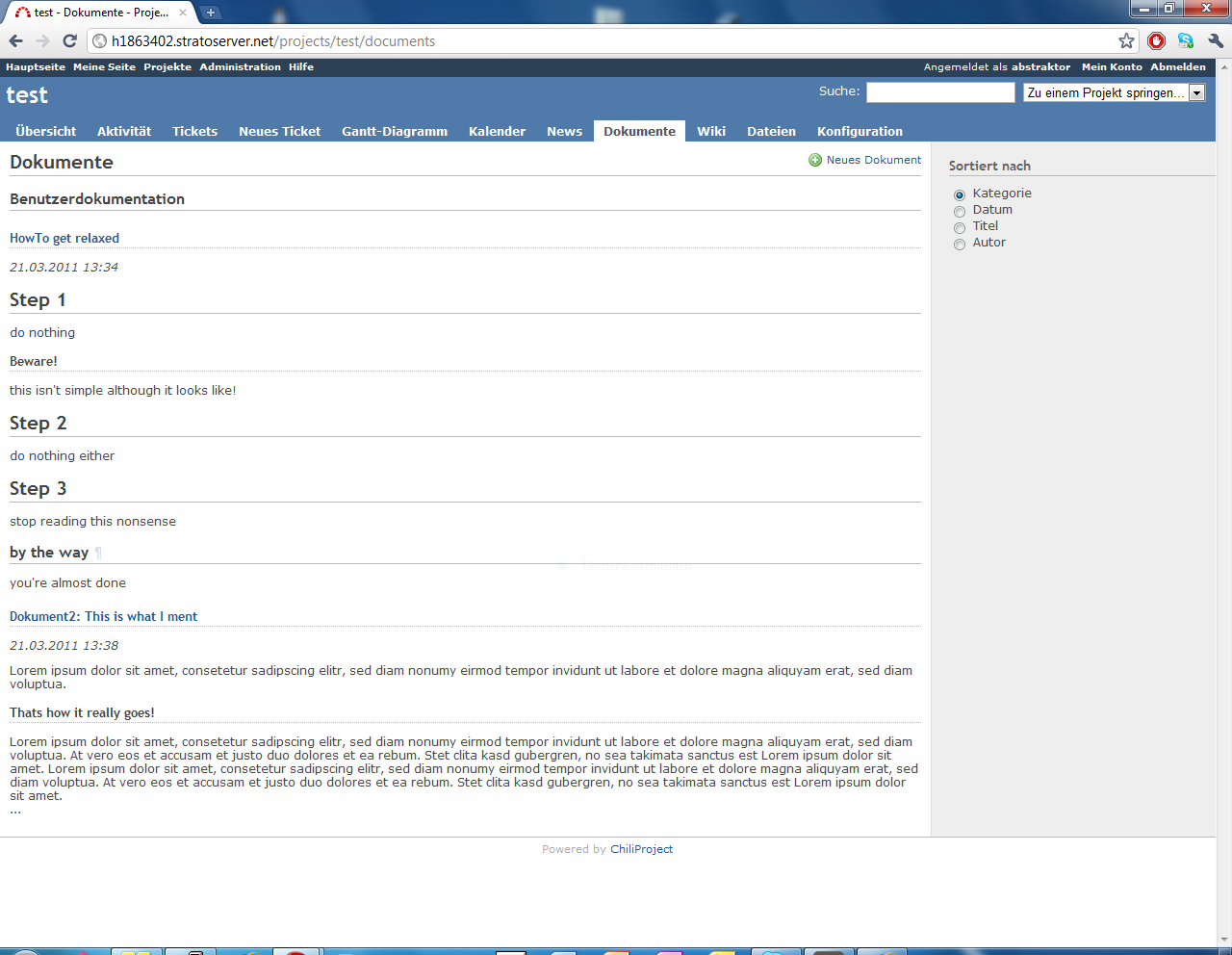
When visiting the document overview of a project, the short preview of a documents content is normally formatted (including headings). This leads to a confusing view, where the difference between documents breaks down and the user who just wants to select a document doesn't now, where to click.
Why don't just add a characteristic css class to this view and format headings without the horizontal line?
History
Updated by Eric Davis at 2011-03-21 11:12 pm
Some more comments at https://github.com/chiliproject/chiliproject/pull/26
- Category changed from Text formatting to User interface
Updated by Tomáš Jukin at 2012-07-22 10:42 pm
We have a new theme but the issue is still here. The document listing (every one, the one in Dashboard and the one in project) is confusing. It is very hard to find out where one document preview begins and ends.
We should use some CSS, or show just names of documents, what do you thing?
This should not be a huge task, should it?
Updated by Tomáš Jukin at 2012-08-15 12:20 pm
Any update to this?