ChiliProject is not maintained anymore. Please be advised that there will be no more updates.
We do not recommend that you setup new ChiliProject instances and we urge all existing users to migrate their data to a maintained system, e.g. Redmine. We will provide a migration script later. In the meantime, you can use the instructions by Christian Daehn.
Remove icons that are not explanatory (Feature #77)
Added by Wieland Lindenthal at 2011-01-18 07:09 am.
Updated at 2011-12-18 07:48 pm.
| Status: | Closed | Start date: | 2011-01-18 |
|---|---|---|---|
| Priority: | Low | Due date: | |
| Assignee: | % Done: | 0% |
|
| Category: | Themes | ||
| Target version: | - | ||
| Remote issue URL: | Affected version: |
Description
I do not like some of the icons of the theme. I think that some of them are confusing. As I tend to be (too) radical in my judgements, I would like to discuss it with you first.
In my opinion icons shall help the eye to find the right thing on the site without reading text. They should not confuse people. I believe it is better to just have text than it is to have text with a bad icon.
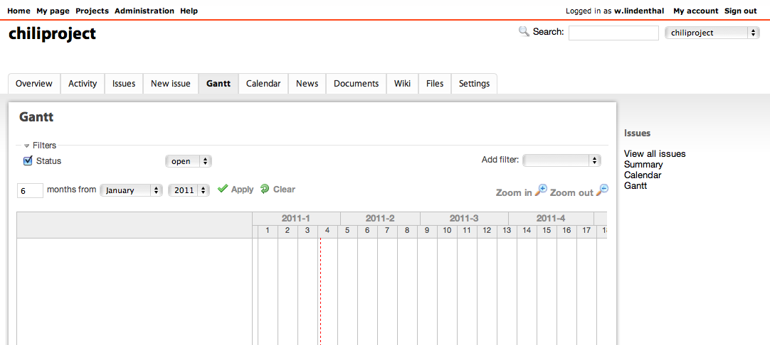
- Tab: Overview - The icon shows a text document with an image. That is not an overview.
- Tab: Activity � The icon show a lightning that indicates Danger. That is not the activity.
- Tab: Roadmap - The icon shows a map. That is not an overview of planned versions.
- Tab: Actually the Calendertab could easily have the same icon as the date picker.
- Tab: News - Shows a newspaper. That might be OK, although we probably will use "News" for Release announcements.
- Tab: Wiki - Shows a file with text. That is not a wiki.
- Tab: Forum - Shows callouts. That is what a forum is about. I like the icon here :-)
- Tab: Files - Shows a zip file. You can upload other files than just zip files. Still I think that the icon works.
- Tab: Settings - The icon shows an equalizer. That is OK. A spanner would be OK, too. I do not have any statistics but I believe that a spanner is the more common icon for settings.
If you do not mind, I would like to take away those bad icons for which we do not find a right replacement. Even a solution without icons would work great for me. I could easily implement the changes on my own.
Let me know what you think.
Wieland
Related issues
| related to Feature #79: Review https://github.com/edavis10/squeejee_theme/pull/1 | Closed | 2011-01-19 |
History
Updated by Eric Davis at 2011-01-18 09:35 am
The theme is open source and located here: https://github.com/edavis10/squeejee_theme/tree/tweaks Feel free to change the icons and send me a pull request. Just make sure the icons are released under an open source compatible license (many of the icons are from the Silk icon package).
Updated by Wieland Lindenthal at 2011-01-18 09:53 am
@Eric: Can I understand your reply as "I generally agree."?
Updated by Eric Davis at 2011-01-18 10:17 am
Wieland Lindenthal wrote:
@Eric: Can I understand your reply as "I generally agree."?
It's more of "what we have works good enough for me but if better options are presented I'm happy to change them". May the best icons win :)
- Category set to Themes
Updated by Wieland Lindenthal at 2011-01-22 09:15 pm
Hey Eric, I forgot to update this issue after sending you the pull request on GitHub.
- Priority changed from Normal to Low
- Assignee changed from Wieland Lindenthal to Eric Davis
Updated by Muntek Singh at 2011-01-22 09:55 pm
Honestly, I prefer poor icons to no icons. It can't be that terribly difficult to find suitable replacements anyways.
Some sources:
http://www.famfamfam.com/lab/icons/silk/previews/index_abc.png
http://fugue-icons-src.googlecode.com/svn/trunk/all-preview.png
http://p.yusukekamiyamane.com/icons/preview/diagona.png
http://tango.freedesktop.org/Tango_Icon_Library
http://www.iconfinder.com/
http://pictos.drewwilson.com/
Updated by Wieland Lindenthal at 2011-01-24 06:21 pm
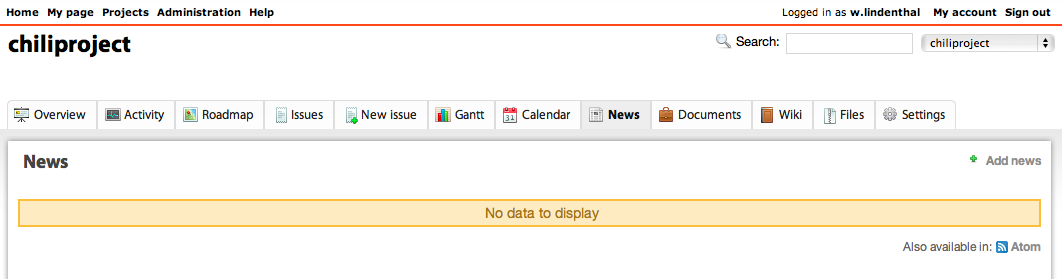
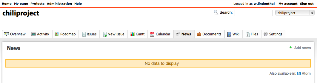
In order to make it easier to comare the actual theme with the patched theme I attach a screenshot of the patched version.
I tried to find alternative icon ideas for those tabs that (imo) do not work:
- Activity: I thought about a track in the snow or sand and found an icon like that:
- Wiki: I think the "W" of Wikipeda could work although it might confuse people with wikipedia.org:
- File design_patch.png added
- File steps.png added
- File wiki_w.png added
Updated by Wieland Lindenthal at 2011-01-24 06:23 pm
Another idea for an icon:
- Gantt
- File plan.png added
Updated by Holger Just at 2011-01-24 07:00 pm
[19:37] <meineerde> wielinde: your gantt logo is nice. would need to find a way to make it work in 16x16
[19:39] <meineerde> wielinde: but I'm against the wikipedia logo. it probably has trademarks attached and is also not really a good logo for the concept of a wiki
The footsteps leave me a bit undecided. My first thoughts on them were dance instructions. It's not abstract enough for my taste. I also like the lightning. It's where the stuff happens, to get a quick insight.
Another possible icon variant is a heartbeat line.
Updated by Eric Davis at 2011-01-24 09:05 pm
I like how the menu is more of tabs but I don't like them without icons. To me the color and images let me recognize the tabs quickly, without them I have to read each tab now.
I'm using the chart icon from the fugue set on my Redmine for Gantt.
-1 on the footsteps, it doesn't make sense to me.
- File chart.png added
Updated by Eric Davis at 2011-01-24 09:50 pm
Wieland:
Reviewing your pull request:
- -1 on removing the icons (as discussed here)
- +1 on making the tabs to look like tabs
- The background on the main content looks odd when there are no tabs (screenshot)
- I like the big blue background on the header as well as the enlarged title (e.g. Feature #77)
- File gap.png added
Updated by Wieland Lindenthal at 2011-01-24 10:20 pm
@Eric: Thanks for reviewing the patch.
Ok, so I will create a new patch that contains the same icons as before but has all the other changes included. When I find better icons I will post them here.
I am not sure about the big and blue headers. Let me think about them and I might come up with a new proposal.
About the icons:
- I believe the foot steps need more than two of them in order to work as a trail. The heart beat line might work. I like the idea.
- I understand Holger's concerns about the wiki icon's copyright. Still I believe that the "W" explains better what that tab is about than the current one. So still we need a better icon. Any suggestions?
- Still we need ideas for a better news icon (a mini "new" badge maybe? Or the typical feed icon with the three waves?)
- Any ideas for the roadmap? Multiple milestones maybe?
- And any ideas for the overview icon?
However, we can collect further ideas and develop proper icons later (if we do not find any nice ones)
- Assignee changed from Eric Davis to Wieland Lindenthal
Updated by Wieland Lindenthal at 2011-01-25 04:47 pm
Just provided a new pull request with a couple of new icons.
- Overview is a (still not nice) signpost
- Activity is a heartbeat (could be nicer too)
- Gantt is quite OK I think
- Calendar in my opinion is OK, too
- News is represented by what I believe it is: a feed.
- Do not be too strict about the roadmap. I drew the icon on myself :P It shall show two milestones (based on the milestones used in the gantt chart).
See screenshot:
Still I have not worked on a solution for the space thing mentioned in space #10. If I remember right, the default theme behaves the same (not optimal) as mine. We could style the login fields to thickbox-like above the background.
Drop your opinion and/or fork me.
- File new_icons.png added
Updated by Holger Just at 2011-01-25 05:03 pm
I really like the Gantt-Icon but would try to remove the black line above the bars. At 16x16, it looks strange. The concept of the activity icon nails it. It could be better integrated into the icon set. It still looks a bit different than the rest.
However I would change the news icon again. Your icon can be understood in two ways:- by people who know RSS: this is the specific Feed icon, which is used in ChiliProject all over the place for feeds. People are going to expect the link to an actual RSS feed.
- by people who don't know feeds (sadly the majority): It just some strange icon the might have seen somewhere on the web, but have no idea what this is about.
Sadly, both interpretations do not cover the hint to news. In my eyes, the original icon (of a newspaper) works better here.
In your overview icon I just see a large T. Only after your explanation of a signpost, I can find a meaning there. I think this is really confusing to new users. What would work better is some kind of "reversed" magnifying glass, e.g. a telescope. Another possibility would be to use it like a dashboard and adopt the mac icon (or a look-alike). The dashboard is btw. something I would generally transform the Overview page to. Today, it has very little value, but a great potential :)
Updated by Wieland Lindenthal at 2011-01-25 06:03 pm
- Holger's concerns about the feed icon for the news are valid. Unfortunately that does not make the current (newspaper) icon better. We need a third idea.
- Holger is right about the activity icon. The one I used is part of the "fugue" icon set. This is the same set as the other icons. I believe we should let a designer design all our icons somewhen.
- As I stated the signpost symbol is of very poor quality so that could be improved. I would like to change the overview to something like a dashboard, too. Unfortunately all small dashboard icons that I found looked like a speedmeter which is not the metaphor that what we need here. A combination of symbols might work (thermometer, speedmeter, ...)
- The gantt chart icon needs something additional to the blue bars that make the icon display a "gantt chart" and not a "object alignment". The current line above the bars groups the bars to a phase. However, the icon could get polished, too.
Updated by Eric Davis at 2011-01-26 02:01 am
Wieland Lindenthal wrote:
- I believe the foot steps need more than two of them in order to work as a trail. The heart beat line might work. I like the idea.
I like the new activity monitor icon.
- I understand Holger's concerns about the wiki icon's copyright. Still I believe that the "W" explains better what that tab is about than the current one. So still we need a better icon. Any suggestions?
A document or HTML page icon could work. Like the one that is used by Overview right now but more "web"-ish.
- Any ideas for the roadmap? Multiple milestones maybe?
I like the existing map icon more than the green one in your screenshot.
- And any ideas for the overview icon?
Not really, the entire Overview page is pretty confusing so it's hard to describe with an icon (in other words, the Overview page is trying to do too much of everything...)
Holger Just wrote:
I really like the Gantt-Icon but would try to remove the black line above the bars. At 16x16, it looks strange.
I agree, Gantt will look good with the black line removed.
However I would change the news icon again. Your icon can be understood in two ways:
I agree. Another problem is that the same icon is used at the bottom of some pages and someone might think that the actual Atom feed is a link to the News.
What about a broadcast tower? Or a different newspaper?
Wieland Lindenthal wrote:
- Holger is right about the activity icon. The one I used is part of the "fugue" icon set. This is the same set as the other icons. I believe we should let a designer design all our icons somewhen.
Fugue is close to the Silk set and can be used along side it most of the time.
- The gantt chart icon needs something additional to the blue bars that make the icon display a "gantt chart" and not a "object alignment". The current line above the bars groups the bars to a phase. However, the icon could get polished, too.
Maybe some red and green lines coming from the left into the boxes? Showing task timelines?
- File transmit.png added
- File transmit_blue.png added
- File newspaper.png added
Updated by Christopher Anderson at 2011-01-27 01:39 am
Hello guys,
I've had a quick pass at the tab icons, using the new_icons.png file that Wieland had created as a base. Thoughts?
- File iconsMockup.png added
Updated by Christopher Anderson at 2011-01-27 01:48 am
Updated by Christopher Anderson at 2011-01-27 02:01 am
Here's a few more takes on the icon for the wiki. My favorite is the open book. The blue book would work better than the brown one.
- File iconsMockup2.png added
- File iconsMockup3.png added
- File iconsMockup4.png added
Updated by Christopher Anderson at 2011-01-27 02:03 am
Another thought for the wiki icon:
- File iconsMockup5.png added
Updated by Muntek Singh at 2011-01-27 05:20 am
Mockup 5 get's my vote as per my other feedback on IRC earlier as well.
Updated by Eric Davis at 2011-01-27 10:34 pm
I like the blue open book with the pencil (iconsMockup5.png). It shows that there are documents here but they are editable. The brown one reminds me of the OSX Address Book icon too much.
I'm not sure about the presentation icon for Overview. It's better than what we have now but still not very clear. I honestly don't think we can find a suitable icon for that tab :)
Updated by Felix Schäfer at 2011-02-01 10:49 pm
- Status set to Open
Updated by Muntek Singh at 2011-05-08 12:12 pm
Christopher - were these sets ever decided one an made available to us?
Updated by Holger Just at 2011-12-18 07:48 pm
The new theme in 3.0.0 gets rid of the icons completely, together with the top-level tabs. Given that, I'd like to close this discussion.
Thanks for all the ideas and the participation in the discussion!
- Status changed from Open to Closed