ChiliProject is not maintained anymore. Please be advised that there will be no more updates.
We do not recommend that you setup new ChiliProject instances and we urge all existing users to migrate their data to a maintained system, e.g. Redmine. We will provide a migration script later. In the meantime, you can use the instructions by Christian Daehn.
New layout (Feature #263)
Added by Eric Davis at 2011-03-06 02:50 am.
Updated at 2011-11-07 05:04 pm.
| Status: | Closed | Start date: | 2011-03-06 |
|---|---|---|---|
| Priority: | Normal | Due date: | |
| Assignee: | % Done: | 0% |
|
| Category: | User interface | ||
| Target version: | 3.0.0 | ||
| Remote issue URL: | Affected version: |
Description
Placeholder feature for merging in the layout and styles from the Shane & Peter plugin I created.
Related issues
| related to Feature #685: Logo uploader | Open | 2011-11-07 | ||
| related to Feature #294: Themes should be a user setting | Ready for review | 2011-03-18 | ||
| related to Feature #559: Group Menus | Closed | 2011-08-05 | ||
| related to Feature #560: Image thumbnailing | Open | 2011-08-05 | ||
| related to Task #58: Colors and Logo | Declined | 2011-01-13 | ||
| related to Feature #654: Captions / Page titles and Breadcrumb | Open | 2011-10-12 | ||
| related to Feature #660: Make the layout usable without activated Javascript | Open | 2011-10-13 | ||
| related to Feature #658: Include jquery and jquery ui | Closed | 2011-10-13 | ||
| related to Feature #692: new design with 263-new-layout-ready | Closed | 2011-11-10 | ||
| duplicated by Bug #164: the themes is mostly unreadable | Closed | 2011-02-09 |
Associated revisions
[#263] Don't output heads_for_wiki_formatter
[#263] Fix journal formatting
[#263] Fix XSS regression from merge
[#263] Fix for changes to the admin_menu
[#263] Fix issue subject style
[#263] Fix admin menu sidebar styling
[#263] Remove duplicated updated label
[#263] Remove the tree of parent issues from the issue title
[#263] Fix the missing line on the top menu
[#263] Merged redmine-reset.css into application.css
[#263] Merging css
- Append main.css to the bottom of application.css
- Remove main.css
- Move print styles out to print.css
- Move the CSS reset to be loaded first
- Port some colors to color.css
[#263] Cleaning up admin menus
[#263] Add icons to the main menu
[#263] Allow setting the page header title
[#263] Move the fugue images into the main images/ directory
[#263] Extract custom colors to color.css
[#263] Remove old themes
[#263] Update SAP theme
[#263] Extract custom S&P images
[#263] Remove duplicated favicon
[#263] Set up default styles
[#263] Override some defaults in the sap theme
[#263] Remove thickbox
[#263] Remove profile popups, never finished
[#263] Merge common.js into application.js
[#263] Replace image background with a theme-able css3 background
[#263] Update jquery load order and embed noConflict in the HTML head directly
[#263] Remove issue tooltip javascript
[#263] Remove new issue lightbox (dead code)
[#263] Remove dead code, was unbound in later JS
[#263] Remove DOM hacks to reposition elements
[#263] Add additional wiki styles
[#263] Remove placeholder thumbnail images
[#263] Remove dead context menu code
[#263] Remove Shane and Peter theme
[#263] Removed and tweaks the design based on feedback
[#263] Fix theme tests that changed singleton data
[#263] Update tests for views in the new layout
[#263] Tests require one theme being present
[#263] Add new layout and theme
Merge branch 'ticket/unstable/263-new-layout-ready' into unstable
[#263] Make issue description the full width
[#263] Refactor: move top menu logic to ApplicationHelper
[#263] Fix test error on Ruby 1.9
TreeNode#to_s (from the rubytree gem) is broken. It is implicitly called by
Shoulda on 1.9 only. As we don't actually need it, we just remove the method.
The bug is reported at http://rubyforge.org/tracker/index.php?func=detail&aid=29435&group_id=1215&atid=4793
History
Updated by Holger Just at 2011-03-06 10:37 am
See UX Overhaul for more info.
Updated by Eric Davis at 2011-03-18 05:57 pm
Bumping out of 2.0.0 because of the rescoping of that release. Should be included in 3.0.0 though.
- Target version deleted (
2.0.0)
Updated by Eric Davis at 2011-07-29 10:48 pm
Okay I've rebased the layout onto the latest unstable (2.1.0) and it's running. This is the minimal version and is mostly view/css/javascript changes. I have some extra changes and features that I want to port from the theme too but I wanted to get some feedback on them before adding them to unstable.
What I'd like to do is:
- If anyone is able to review and test the new layout as it works now, I'd be happy to make minor changes
- I'll be fixing the Bugs listed on the 263_Layout page. These are minor bugs and merge issues so they don't need new issues.
- I'd like to get some quick opinions on the list of proposed features from 263_Layout. If you could read each feature and answer in this issue with: Yes, No, or More Details then that would work best. I'll create new Forums discussions and issues if there are a few people asking for More Details.
Branch location based on 74cfd7b5ca
Updated by Eric Davis at 2011-07-29 10:52 pm
Oh and I'll post some screenshots in a minute, I'm trying to make sure my data is good.
Updated by Eric Davis at 2011-07-29 11:14 pm
And here are the screenshots. Note, these are actual screenshots, not comps or photoshop mockups.
- Status changed from Open to Needs more information
Updated by Niels Lindenthal at 2011-08-01 09:46 am
Hi Eric,
Congrats, this is a major improvement. Thanks for the work on the new layout.
We just started an accessability initiative with one of our clients. The goal of this project is that users with a handicap (e.g. blind users) can more easily use ChiliProject. We identified about 30 problems with the current application. We will try to fix most of the problems in August. Here at finnlabs Philipp and Johannes are in charge of the development. If you are interested I will ask them to set up a short meeting that we can provide you and everybody else who is interested an overview of the identified problems and the proposed solutions.
Regards
Niels
Updated by Enrique GarcÃa Cota at 2011-08-04 01:22 pm
- Logo uploader for the header section: Yes
- Several different color combinations for the "themes": Yes. Extra points if somehow that's associable with the environment (development, production, staging)
- Add raw CSS to every page: No (at least not to every page. One global one should be enough)
- Add raw JavaScript to every page: No (not to every page)
- Issues list - change the right click to right+left: No
- Issues list - add a "popup" tooltip to show details about each issue when hovering on the row: Yes
- Jquery (1.3.2): this does not mean porting the existing JavaScript to jQuery yet: More details. How is the current javascript going to coexist?
- JS - review and decide which lightbox library to use: Yes. Jquery-based lib.
- Group menus - Instead of the flat menus shown we can group menu items: More details. I actually like having "Issues" and "New issue". It's convenient. Let's see those screenshots.
- Image thumbnailing: No. I mean, yes, it's a cool feature, but I don't think that should be considered part of the "theme". Image thumbnailing should have its own branch, development, and issues. It should not be thrown into the "theme" bag.
- Add MIME icons for common file formats (e.g. document icon for Word docs): Yes, if it's only css + js, or maybe some minor server-side script.
- Issue details - filename, upload date, uploader, and description as table columns. I think this is easier to read. Yes.
Updated by Eric Davis at 2011-08-05 03:37 pm
Niels:
Improving the accessibility would be great. I've done some work on it but there are a lot of improvements we could still do. I think it would be best if you could have Philipp and Johannes post their discussion in the forums here so everyone can be included.
Updated by Eric Davis at 2011-08-05 03:41 pm
Enrique GarcÃa Cota wrote:
- Add raw CSS to every page: No (at least not to every page. One global one should be enough)
- Add raw JavaScript to every page: No (not to every page)
Sorry, I meant that there is one place in the Administration panel where you can enter raw CSS and JavaScript which is then loaded onto every page.
- Jquery (1.3.2): this does not mean porting the existing JavaScript to jQuery yet: More details. How is the current javascript going to coexist?
jQuery has some compatibility options we would set so it will not conflict with Prototype (our current JavaScript). I've been doing this in all of my plugins.
- Group menus - Instead of the flat menus shown we can group menu items: More details. I actually like having "Issues" and "New issue". It's convenient. Let's see those screenshots.
Okay, I'll create a new issue to discuss further.
- Image thumbnailing: No. I mean, yes, it's a cool feature, but I don't think that should be considered part of the "theme". Image thumbnailing should have its own branch, development, and issues. It should not be thrown into the "theme" bag.
Okay, I'll create a new issue.
- Add MIME icons for common file formats (e.g. document icon for Word docs): Yes, if it's only css + js, or maybe some minor server-side script.
It's mostly images and some code that checks for the MIME type. I'll add it to the image thumbnailing feature since it's related.
Updated by Holger Just at 2011-08-05 04:31 pm
Eric Davis wrote:
Enrique GarcÃa Cota wrote:
- Add raw CSS to every page: No (at least not to every page. One global one should be enough)
- Add raw JavaScript to every page: No (not to every page)
Sorry, I meant that there is one place in the Administration panel where you can enter raw CSS and JavaScript which is then loaded onto every page.
cough http://dev.holgerjust.de/projects/redmine-wiki-css
So +1 from me :)
- Group menus - Instead of the flat menus shown we can group menu items: More details. I actually like having "Issues" and "New issue". It's convenient. Let's see those screenshots.
Okay, I'll create a new issue to discuss further.
We could have a split tab. So that there is an additional sub-button on some tabs (issues, wiki) which will create a new item...
- Image thumbnailing: No. I mean, yes, it's a cool feature, but I don't think that should be considered part of the "theme". Image thumbnailing should have its own branch, development, and issues. It should not be thrown into the "theme" bag.
Okay, I'll create a new issue.
- Add MIME icons for common file formats (e.g. document icon for Word docs): Yes, if it's only css + js, or maybe some minor server-side script.
It's mostly images and some code that checks for the MIME type. I'll add it to the image thumbnailing feature since it's related.
I started working/thinking about completely revamping the current attachment model / controller stuff. To allow post-precessing (e.g. creating of thumbnails) and more flexible display/download of things (more supproted datatypes, inline display of images and text). Also support for multiple ways to save attachments (e.g. local filesystem plain, local fs with complex folder structures, S3, ...)
That said, I propose you add the thing to unstable and let us work the things out on code and not just with words :)
Updated by test ify4 at 2011-08-05 06:03 pm
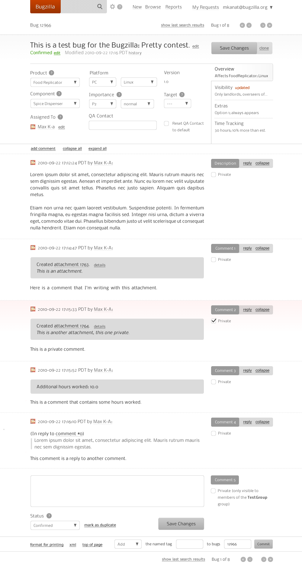
- great use of color and shape for status and its changes: http://people.mozilla.com/~faaborg/files/daf/bugzillaTheme%5Bbracket%5D.png
- smaller information overload by using tabs: https://wiki.mozilla.org/images/7/79/JWilde-BugzillaPretty-Bug-27-2-2011.png
More info:
https://wiki.mozilla.org/Bugzilla:Pretty
http://bugzillaupdate.wordpress.com/2011/03/31/winner-of-the-make-bugzilla-pretty-contest/
Thanks for your consideration.
Updated by Jan Wedekind at 2011-08-05 06:53 pm
Just a couple of thoughts
I actually like having "Issues" and "New issue". It's convenient. Let's see those screenshots.
Actually, I think that has always been a weird UX/UI thing in Redmine/Chiliproject. the "New Issues" button clearly is an action button, not a "view button" or menu. I have seen it many times that new users cannot find the way to report a new issue because it appears as a menu item.
It definitely is convenient and useful to have, I've just always felt that "New Issue" should be clearly separated from the main menu and clearly identifiable as a button.
Sidemenu: what is the reason to move the project menu to the side? In the current S&P proposal, you don't gain any space in the vertical axis, which for me would be the main motivation for moving it to the side considering the predominance of wide-screen displays nowadays.
Account/Username: I think those two can be merged. There is no reason I can see why "My account" can't be a link under "myusername" - one top menu items less = less clutter
Spent time: Why has that moved under the menu on the left?
Overview page/My page: Has anyone ever thought about merging those things a bit more? I think what interests me more when I enter a project is what matters to me as a user/member in the project. As a project manager, I much rather have a separate "Report" section for project metrics etc. (or call it "Project status").
To put it another way: when does anyone actually ever use the "Overview" page for more than clicking through to a page containing information you actually are looking for? Rarely I think in daily usage. But Chiliproject is a tool for work, so it should make getting to my work as quickly and easily as possible. Consider: there is no quick way to list all issues in the project currently assigned to me. Quickest way would be a custom report on the issues page, which two clicks away from Overview (assuming the user even knows that custom report exists).
Long story short:
Suggestion: Reform "Overview" to "My project dashboard" displaying user-centric project-related often-used information. Move project summary/background info into the background or a separate "Project status" page...
Issue view: I like some concepts from bugzilla, in particular the grouping of issue information (what/when/who). Right now, it's a flat table without much visual aid.
Speaking of clutter: why do I need the field descriptors in the view? E.g., do I need the heading "Description"? Do I need "Status:", "Priority:", "%done"? The information next to it speaks for itself. When filling out the issue, that is different, but in the plain view I wonder why it is necessary. I think it just clutters and looks very technical/non-humane. Just look at the screen and ask yourself if you need those. For the others, I also would prefer human interface, e.g. "assigned to Jan" rather than a technical table looking "Assignee: Jan".
Hope that helps! Thanks for your great work everyone.
Updated by Eric Davis at 2011-08-05 07:22 pm
Holger Just wrote:
We could have a split tab. So that there is an additional sub-button on some tabs (issues, wiki) which will create a new item...
Taking this to #559 along with a screenshot.
I started working/thinking about completely revamping the current attachment model / controller stuff.
Lets talk in #560, we found a major flaw with post-processing images.
That said, I propose you add the thing to unstable and let us work the things out on code and not just with words :)
Working on it...
Updated by Eric Davis at 2011-08-05 07:37 pm
Jan Wedekind wrote:
Actually, I think that has always been a weird UX/UI thing in Redmine/Chiliproject. the "New Issues" button clearly is an action button, not a "view button" or menu. I have seen it many times that new users cannot find the way to report a new issue because it appears as a menu item.
It definitely is convenient and useful to have, I've just always felt that "New Issue" should be clearly separated from the main menu and clearly identifiable as a button.Sidemenu: what is the reason to move the project menu to the side? In the current S&P proposal, you don't gain any space in the vertical axis, which for me would be the main motivation for moving it to the side considering the predominance of wide-screen displays nowadays.
The problem is that as more menu items are added the screen keeps going horizontally. I've seen an install that had 3 rows of menu items, it wasn't pretty at all.
If we group menu items then we do get a lot of vertical space since menus are closed when you aren't in their section. E.g. the issues menu is closed when you are in forums.
Account/Username: I think those two can be merged. There is no reason I can see why "My account" can't be a link under "myusername" - one top menu items less = less clutter
I agree but it's out of scope for the theme. We would need to make several changes on the backend for that.
Spent time: Why has that moved under the menu on the left?
That is because it's on the sidebar. I'd like to move it up into the actual menu so you can check time from any page in a project (instead of having to go to the overview). The screenshot in #559 has that under the Reports group (I'd like to put it in it's own group though). You can see how some of the links that are on a Wiki sidebar have been moved up into the Wiki group.
Suggestion: Reform "Overview" to "My project dashboard" displaying user-centric project-related often-used information. Move project summary/background info into the background or a separate "Project status" page...
Yes, we've talked about adding some per-project widgets similar to My Page. That's a whole separate feature though, could you start a forum discussion on it so we can figure out what would work best?
Issue view: I like some concepts from bugzilla, in particular the grouping of issue information (what/when/who). Right now, it's a flat table without much visual aid.
I think I might try to group and organize the data here after the main design is done. It is pretty cluttered still.
why do I need the field descriptors in the view? E.g., do I need the heading "Description"? Do I need "Status:", "Priority:", "%done"? The information next to it speaks for itself.
It speaks for itself only if you know what your data is. Inexperienced users will not know that "IE7" is the custom field "Bug in browser". Even something simple as "New" could be confusing: does it mean that I haven't seen this issue or that the status is New.
We also need to keep in mind accessibility, removing labels could make it more difficult on screen readers.
For the others, I also would prefer human interface, e.g. "assigned to Jan" rather than a technical table looking "Assignee: Jan".
I think I'll need to see the full page in order to give you an answer.
Updated by Eric Davis at 2011-08-05 07:45 pm
I've fixed most of the "bugs" from the wiki page 263_Layout. I'd still like to do a page-by-page review of the major sections at least but the design should be semi-usable now.
I've also rebuilt the themes a bit:
- Removed all of the existing themes
- Moved the Shane & Peter design and colors into a new CSS theme (sap)
- Updated the Default theme to be similar to what we have here: whites, grays.
- Added a quick and dirty ChiliProject logo
I think I'll be able to merge this to unstable next week and we can start debugging it. At that time I'd also like to get some help working on the default theme and building new themes for at least the common colors.
https://github.com/edavis10/chiliproject/tree/ticket/unstable/263-new-layout
Updated by Enrique GarcÃa Cota at 2011-08-08 07:18 am
Hi Eric,
I just thought of something that's possibly a theme thing:
- Being able to choose a favicon
In my mind, the favicon (and iphone shortcut icon(s) ) is also part of the design. But you might think otherwise.
Updated by Jan Wedekind at 2011-08-08 02:03 pm
Eric Davis wrote:
Jan Wedekind wrote:
Actually, I think that has always been a weird UX/UI thing in Redmine/Chiliproject. the "New Issues" button clearly is an action button, not a "view button" or menu. (...).
Is there any thought on this? Or am I the only one who's observed confused newbies trying to find the "New issue" button? :)
The problem is that as more menu items are added the screen keeps going horizontally. I've seen an install that had 3 rows of menu items, it wasn't pretty at all.
True. I try not to activate so many modules, at least not from the start, but if all of them are on, it's really ugly. I think I just prefer horizontal menus over vertical ones. And maybe the fundamental problem isn't then the theme/design as such? Not sure to be honest, just thinking aloud.
If we group menu items then we do get a lot of vertical space since menus are closed when you aren't in their section. E.g. the issues menu is closed when you are in forums.
I would still try to squeeze out more space by making the header section smaller, i.e. gaining the space the project menu used before.
Account/Username: I think those two can be merged. (...)
I agree but it's out of scope for the theme. We would need to make several changes on the backend for that.
I realized just after posting that this would be another issue. Sorry for confusing things.
Spent time: Why has that moved under the menu on the left?
That is because it's on the sidebar. I'd like to move it up into the actual menu so you can check time from any page in a project (instead of having to go to the overview). The screenshot in #559 has that under the Reports group (I'd like to put it in it's own group though). You can see how some of the links that are on a Wiki sidebar have been moved up into the Wiki group.
Very good! I can see how that would be much more useful.
Suggestion: Reform "Overview" to "My project dashboard" displaying user-centric project-related often-used information. Move project summary/background info into the background or a separate "Project status" page...
Yes, we've talked about adding some per-project widgets similar to My Page. That's a whole separate feature though, could you start a forum discussion on it so we can figure out what would work best?
Will do! As above, I realized myself that this can't be done via a theme, sorry...
why do I need the field descriptors in the view? E.g., do I need the heading "Description"? Do I need "Status:", "Priority:", "%done"? The information next to it speaks for itself.
It speaks for itself only if you know what your data is. Inexperienced users will not know that "IE7" is the custom field "Bug in browser". Even something simple as "New" could be confusing: does it mean that I haven't seen this issue or that the status is New.
I wasn't talking about custom fields, for those it's necessary.
But I think it would be good to discuss that once the main design work is done. I would still argue that many of those things are not needed or, at least, can be replaced by different wording or visual cues that make the whole thing more appealing.
Imagine for example using a bit of CSS and Color to differentiate issue Categories and status. If I could assign a color to the status I define, it helps a lot when scanning an issue.
We also need to keep in mind accessibility, removing labels could make it more difficult on screen readers.
Isn't it possible to use the ID Attribute?
For the others, I also would prefer human interface, e.g. "assigned to Jan" rather than a technical table looking "Assignee: Jan".
I think I'll need to see the full page in order to give you an answer.
Ok, I will try to mock up something. I am lousy at this but I might get the idea across. I might post it first in the forum to not sidetrack this issue any further.
Updated by Felix Schäfer at 2011-10-08 02:42 pm
See for a new proposition.
Updated by Romano Licker at 2011-10-12 03:27 pm
Niels already presented our Layout contribution here https://www.chiliproject.org/boards/2/topics/814.
We started where Eric left off (263-new-layout branch).
We updated to Chili 2.3 a few days ago - our
current design development branch is: https://github.com/finnlabs/chiliproject/tree/feature/2.3.0/finn-design
Everything we will propose is already implemented and can be tested here:
https://ux.finn.de/
- we used the project navigation Eric designed and extended it by the grouping feature proposed by Eric in #559
- accounts and username merged (Jan Wedekind's proposal - #263)
- the login now works within the main-navigation making use of a pulldown dialog
- Erics hover from S&P - Theme was improved by an OS-X-like menu behavior, where you trigger the hover by click and it stays active until you chose an element or click anywhere in the html
(for additional information about hover menus you can visit http://uxmovement.com/navigation/why-hover-menus-do-users-more-harm-than-good/) - we scaled down the space used for the top-bar
This way we have more information "above the fold". Therefore we designed a smaller logo (see #58) which fits the top bar. The breadcrumbs also moves to a static location within the top-bar, saving yet more space. - the main-navigation has larger buttons, addressing accessibility issues the previous design with its smaller buttons (using hover) has had
- the project navigation search is a major improvement since you can switch between projects much faster
- the designer Christoph Zierz from zz | media http://www.zzmedia.net/ helped us choosing styles, arrangement and colors (see #58)
- we cleaned up the main content by removing the container styles making it simple, easy and comfortable to read
- we are trying to normalize the content, its controls and captions (for caption discussion see #654)
For example regarding controls: "New issue", "new wiki page" and "new subproject", which are basically the same operations, are all to find at different positions on the page.
This is just a brief summary of what happend. If you want to discuss certain elements feel free to open a new ticket or visit the referenced issues.
- Target version set to 2.4.0
Updated by Holger Just at 2011-10-12 04:50 pm
The theme will be part of the 3.0 release if it is ready until then. We are going to have too many changes for a minor release.
- Target version changed from 2.4.0 to 3.0.0
Updated by Eric Davis at 2011-10-12 04:55 pm
Romano Licker wrote:
Target version set to 2.4.0
This can't go into 2.x. It is a major change that breaks backwards compatibility (themes). 3.x would be the soonest but the target version shouldn't be set until this is done.
This needs to be reviewed and committed in stages. There are a lot of changes and that I want to make sure that we take things slow and review everything before committing it. I felt that even the code I wrote was too large to be committed at once (which is why I started separating it out into smaller features).
I suggest we do things in a few stages:
- Finish reviewing the stuff I worked on (e.g. removing JS that isn't used, etc)
- Commit my version of the new layout
- Review color changes and basic layout changes in "finn-design" and commit
- Review each new feature separately and commit later (Example: #559, #263)
(I don't want this to turn into a headache like acts_as_journalized was: a great feature that was rushed in before it was fully understood and tested. By doing the design in stages we can avoid one huge chunk of code and also keep the branch so development can continue.)
These should be handled separately (stage 4 above).
- the login now works within the main-navigation making use of a pulldown dialog
I like it. If the code is minor enough I think it could be included as part of stage 3.
- Erics hover from S&P - Theme was improved by an OS-X-like menu behavior, where you trigger the hover by click and it stays active until you chose an element or click anywhere in the html
(for additional information about hover menus you can visit http://uxmovement.com/navigation/why-hover-menus-do-users-more-harm-than-good/)
Can you elaborate on this in a new issue (feature, stage 4)? I think the existing hovering behavior is bad and one version I did in the S&P theme was only an improvement.
- we scaled down the space used for the top-bar
This way we have more information "above the fold". Therefore we designed a smaller logo (see #58) which fits the top bar. The breadcrumbs also moves to a static location within the top-bar, saving yet more space.
It looks like some of this is CSS but it might need adjusting first (stage 3). I'd like to have the header size easy to change in a theme for designs that have a larger header (like my business design).
I'll comment on the logo and colors in #58 directly.
- the project navigation search is a major improvement since you can switch between projects much faster
Project search should be a separate feature (stage 4).
Overall tl;dr: I like the direction of this but we need to split up the changes into stages so they can be reviewed properly.
- Target version deleted (
3.0.0)
Updated by Eric Davis at 2011-10-28 10:28 pm
I've finished reviewing and removing the JavaScript and bugs on the wiki page. The pull request is ready for unstable. Please review the Ruby and view code at least. The CSS will be near-impossible to review by reading through it.
There are still a bunch of minor visual bugs in the main theme but I'm not going to fix them with we are going to be reviewing the finn-design version soon.
- Status changed from Needs more information to Ready for review
Updated by Felix Schäfer at 2011-11-03 03:39 pm
Just for everyone to know (Eric already knows, he's already been responding to the comments :-) ), Holger and I just reviewed the pull request, the comments are in the pull request on GitHub, but it mostly looks OK.
Eric: Sorry if I was a little terse/harsh in the review comments, long day/not much time, no harm meant.
Updated by Eric Davis at 2011-11-03 04:39 pm
Felix Schäfer wrote:
Eric: Sorry if I was a little terse/harsh in the review comments, long day/not much time, no harm meant.
It's fine. I'm feeling like this issue is getting discussed to death and the overall goal of this feature is getting lost.
Updated by Eric Davis at 2011-11-07 03:07 am
I've updated the branch with feedback from Felix, fixed a few test errors, and pushed the new layout to unstable (ab2856b).
Next the finn-design branch should be updated to the latest unstable branch and we can start it's review. It would probably be best to create a new issue for that so the discussion can stay focused.
Other features that have been extracted can now be worked on separately (e.g. submenus, thumbnails, etc).
- Target version set to 3.0.0
- Status changed from Ready for review to Closed
Updated by Felix Schäfer at 2011-11-07 06:05 am
Eric Davis wrote:
I've updated the branch with feedback from Felix, fixed a few test errors, and pushed the new layout to unstable (ab2856b).
Holger's and mine, and thanks :-) I'll have a look at the changes, if there's still something bad enough that I think it worth discussing I'll open a new issue.
Updated by Eric Davis at 2011-11-07 05:04 pm
Felix Schäfer wrote:
Holger's and mine, and thanks :-) I'll have a look at the changes,
Yea, Holger's too. I just remember seeing your gravatar all over that pull request.
if there's still something bad enough that I think it worth discussing I'll open a new issue.
And if it's small, just fix it.